As we transition between the final stages of the Riverbluff house and starting our next house, we are trying to cross off some outstanding punch list items from previous projects. I thought it might be a good chance to look at some interesting elements from previous houses.
Today’s house: Montrose. 3 punch items: 1. handrail bracket had come loose going up the stairs (bracket wasn’t properly fastened into the stud). 2. Pocket door to bathroom was clanging against metal pocket door stud, which for some reason was slightly bowed inwards (a little bit of a pain, but we were able to pull the stud farther out without too much drywall repair). 3.The really nice induction stove was supposed to come with a set of pots and pans as a promotional item (still battling with Lowe’s rebate department on that one.)
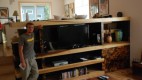
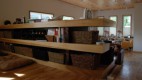
So, the most dominant interior element of the house was the built in shelving unit that divides the large living room from the dining room, which is up a short set of stairs. We needed something that broke up a wide open 1st floor and played with the change in floor heights. In terms of functionality, we wanted to balance the needs of storage for the kitchen and dining room with that of the enertainment zone for the living room.
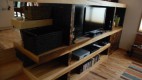
Equally important, we wanted the built in to act as a natural divider between the kitchen/dining area and the larger living room/great room while still maintaining the overall openness and flow of the space. To accomplish this, Tommy left pockets of the shelving open with no backing, so you could see all the way through and have that sense of transparency between rooms. I also love on the the far left side how he left some ends open and allow the shelves to cantilever out and reach out to you as you climb the steps. I also like how the homeowners didn’t actually put anything on those shelves, so you able to experience that.
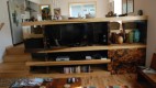
In terms of process and materials, the skeleton was made up of 2×4 material, with the horizontal shelving clad in poplar and the vertical planes clad in plywood. Tommy’s original idea was to have a nice strong contrast between the horizontal and vertical by having the vertical clad in a rougher metal finish, like corten or steel plate, to really allow the poplar shelving to pop. Sad to say, I put the kabosh on that one because of cost and we went with plywood. Originally we stained the plywood a dark grey, but our application looked too faux amateurish. Too cheesy.
Tommy’s solution: to burn the plywood to different degrees with a blow torch and then seal with polyurethane. Maybe a little too leopardy for my tastes, but still a cool effect. I will say the homeowners picked up on that tone and have a lot different shades of brown furniture that plays off of it.
Overall, I like how when you are up in the kitchen, the top of the built in shelving acts as a great place to lean up against, rest your drink and look down on the expansive living room.